Projectassistant
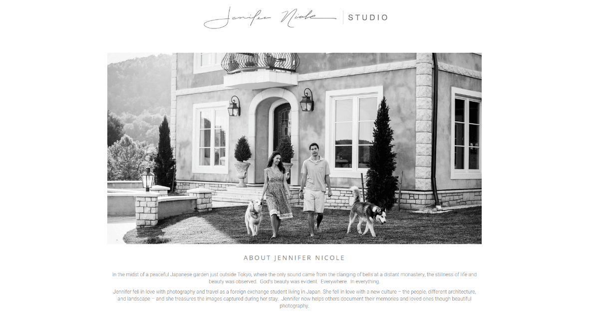
Jennifer Nicole is a professional photographer we’ve had the pleasure of working with since 2014. We’ve redesigned her site twice over the years to keep up to date with her growing business and portfolio. This time, Jennifer needed a fresh new design to step away from her old brand and focus on a new target market. She wanted a responsive website that made it easy for her to update page content and showcase her diverse work.
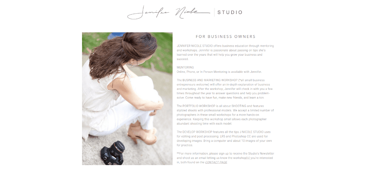
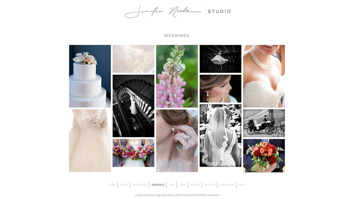
We’ve always designed to put all focus on Jennifer’s photos. We previously designed the homepage to feature a full-page, retina-ready sliding banner. In this redesign, we wanted to show more of her work and at the same time switch up the navigation. Jennifer’s photos ar4e now tiles across the homepage and serve as links to her collections and other pages on the site. We also moved the menu and social media icons to the footer to ensure all eyes were on her photos. The rest of the site follows the light, organized and simple theme.

Jennifer’s website if fully responsive and has been optimized to load pages faster without compromising the quality of her photos. We also converted the website’s old custom theme to a Sage theme, a more modern web development framework.
As for the blog, we used a CMS that was easy for Jennifer to update as she pleased. All content was then migrated from the old blog to the new one. The blog maintains the same user experience when navigating from the Collection page and other areas of the site by using the same filter method to sort imagery or blog posts with a slight variation in style.
Most importantly, we made sure Jennifer’s target audience had plenty of options to contact her. Jennifer’s contact page has a custom Gravity Form and sign ups for her RSS Feed and her newsletter. Any leads from the site are directly integrated into her email campaign. We also integrated her social media accounts for easy social sharing.
Lorem ipsum dolor sit amet, consectetur adipiscing elit. In vestibulum euismod eros, a interdum neque vulputate nec. Nulla viverra sagittis consectetur. Maecenas est leo, bibendum quis egestas non, maximus ut orci. Curabitur enim tellus, porta volutpat ullamcorper ac, pharetra non tellus. Donec at iaculis ligula. Phasellus molestie magna arcu, non venenatis arcu condimentum id. Aliquam et tempor lectus. Mauris dignissim enim nisl, eu varius nunc laoreet non. Interdum et malesuada fames ac ante ipsum primis in faucibus. Mauris ornare erat non sapien aliquet dictum. Donec convallis interdum magna, auctor luctus metus commodo suscipit. Maecenas tempus leo turpis. Cras ac massa dolor.

Lorem ipsum dolor sit amet, consectetur adipiscing elit. In vestibulum euismod eros, a interdum neque vulputate nec. Nulla viverra sagittis consectetur. Maecenas est leo, bibendum quis egestas non, maximus ut orci. Curabitur enim tellus, porta volutpat ullamcorper ac, pharetra non tellus. Donec at iaculis ligula. Phasellus molestie magna arcu, non venenatis arcu condimentum id. Aliquam et tempor lectus. Mauris dignissim enim nisl, eu varius nunc laoreet non. Interdum et malesuada fames ac ante ipsum primis in faucibus. Mauris ornare erat non sapien aliquet dictum. Donec convallis interdum magna, auctor luctus metus commodo suscipit. Maecenas tempus leo turpis. Cras ac massa dolor.
Lorem ipsum dolor sit amet, consectetur adipiscing elit. In vestibulum euismod eros, a interdum neque vulputate nec. Nulla viverra sagittis consectetur. Maecenas est leo, bibendum quis egestas non, maximus ut orci. Curabitur enim tellus, porta volutpat ullamcorper ac, pharetra non tellus. Donec at iaculis ligula. Phasellus molestie magna arcu, non venenatis arcu condimentum id. Aliquam et tempor lectus. Mauris dignissim enim nisl, eu varius nunc laoreet non. Interdum et malesuada fames ac ante ipsum primis in faucibus. Mauris ornare erat non sapien aliquet dictum. Donec convallis interdum magna, auctor luctus metus commodo suscipit. Maecenas tempus leo turpis. Cras ac massa dolor.