TL;DR
A design system is more than a style guide with brand colors. It is a structured library of reusable components, rules, and patterns that keep your product visually and functionally consistent. Consistency builds user trust, speeds up development, and reduces design debt. If your product looks different on every page, you are making users work harder than they should — and that costs you conversions.
The Difference Between a Style Guide and a Design System
Most businesses have a style guide. It includes a logo, brand colors, maybe some typography rules and a few icon standards. It tells you what the brand looks like. That is useful, but it is only part of the picture.
A design system goes further. It tells you how the brand behaves in a product. It includes reusable components — buttons, forms, cards, navigation patterns — with documented states, sizes, and interaction behaviors. It defines spacing scales, layout grids, and motion principles. And it comes with guidelines on when and how to use each element.
Think of a style guide as a dictionary. A design system is the grammar that turns words into coherent sentences.
Why Consistency Matters More Than You Think
Humans are pattern-recognition machines. When users interact with your product, they are constantly building a mental model of how it works. Every button, every form, every navigation element either reinforces that model or breaks it.
When a primary action button is blue on one page and green on another, users hesitate. When a form input looks different in the checkout flow than it does on the contact page, users slow down to re-learn the interface. Each inconsistency introduces a small moment of friction. Those moments compound.
Research from the Nielsen Norman Group consistently shows that interface consistency is one of the top usability heuristics. Users trust consistent interfaces because they are predictable. Predictable interfaces feel professional. Professional feels trustworthy. Trustworthy converts.
The Core Components of a Design System
A practical design system has several layers. Each builds on the last to create a coherent whole.
Design Tokens
These are the foundational values: colors, font sizes, spacing units, border radii, shadow depths. They are named with purpose — not “blue-500” but “color-primary” or “spacing-medium.” Tokens create a shared language between designers and developers. When a token value changes, it updates everywhere at once.
Typography System
Beyond choosing a typeface, a typography system defines a clear hierarchy. How large is an h1 versus an h2? What is the body text size? What about captions, labels, and helper text? A well-defined type scale ensures that headings, body copy, and supporting text look intentional on every page.
Color System
A color system assigns roles to colors. Primary actions get one color. Destructive actions (delete, remove) get another. Success, warning, error, and informational states each have their own palette. Backgrounds, text, borders, and interactive elements all pull from this defined set. This prevents the gradual drift where every new page introduces a slightly different shade of blue.
Spacing and Layout
Consistent spacing is one of the most underrated elements of professional design. A spacing scale — typically based on a base unit like 4px or 8px — ensures that margins, padding, and gaps between elements follow a predictable rhythm. It is the difference between a page that feels organized and one that feels random.
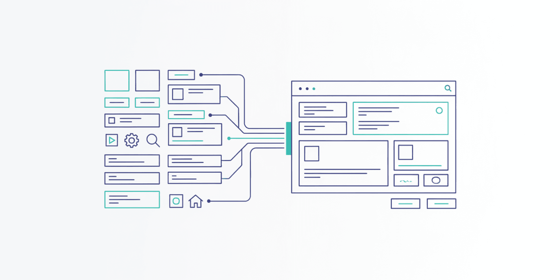
Component Library
This is the most visible part of a design system. Buttons, input fields, dropdown menus, modals, cards, tables, alerts — each documented with its variants, states (default, hover, active, disabled, error), and usage guidelines. A developer building a new feature should be able to assemble it from existing components rather than inventing new ones.
How Design Systems Speed Up Development
Without a design system, every new feature starts with a series of small decisions. What should this button look like? How much space goes between these elements? Is this the right shade of gray? These decisions take time, and different people make them differently.
With a design system, most of those decisions are already made. A developer pulls in the existing button component, applies the standard spacing, and uses the defined color tokens. The feature looks consistent with the rest of the product by default. No guesswork. No back-and-forth design reviews for basic elements.
This compounds over time. Teams with mature design systems report significantly faster feature development because the baseline work is done. Designers focus on solving new problems rather than re-specifying solved ones. Developers build faster because they are assembling from proven parts rather than coding from scratch.
Design Debt: What Happens Without a System
Without a design system, products accumulate design debt. It starts small. One developer uses 14px body text while another uses 16px. A third page uses a slightly different card shadow. A new hire builds a custom dropdown because they did not know one already existed.
Over months and years, this debt grows. The product becomes a patchwork of inconsistent patterns. Users notice, even if they cannot articulate what feels off. Maintenance costs rise because every page is a unique snowflake. Redesigns become massive undertakings because there is no shared foundation to build on.
A design system prevents this debt from accumulating. It does not eliminate the need for new design work, but it ensures that new work builds on a solid, consistent base rather than drifting further from one.
When to Invest in a Design System
Not every project needs a full design system on day one. A single landing page does not warrant the investment. But as soon as your product has multiple pages, multiple developers, or plans to grow, a design system starts paying dividends.
Key signals that you need one:
- Designers and developers frequently disagree on how things should look
- New features take longer than expected because of design decisions
- Your product looks noticeably different across pages or sections
- Multiple people are building UI and making independent style choices
- You are planning a redesign or a major feature expansion
The best time to start a design system is before you need one urgently. The second best time is now.
Design Systems and User Trust
Trust is built through repeated, reliable interactions. When your interface looks and behaves the same way every time a user encounters it, they develop confidence in your product. They know what a primary button looks like. They know where to find navigation. They know how forms work.
This confidence reduces cognitive load. Users spend less mental energy figuring out your interface and more energy engaging with your content, completing tasks, and making purchasing decisions. That is the business case for visual consistency in a single sentence: less friction, more action.
Build a Foundation That Scales
A design system is an investment in your product’s future. It makes today’s development faster and tomorrow’s growth smoother. If your product has outgrown its ad-hoc approach to design and you are ready to build on a solid visual foundation, Project Assistant’s UI design team can help you create a system that scales with your business. Let’s talk about what consistency could do for your conversion rates.


