TL;DR
Great user experience isn’t a design luxury — it’s a business advantage. Seven core principles drive it: consistency, feedback, simplicity, accessibility, visual hierarchy, error prevention, and user control. Nail these and your digital product converts better, retains more users, and costs less to support. Ignore them and you’ll wonder why traffic doesn’t translate to revenue.
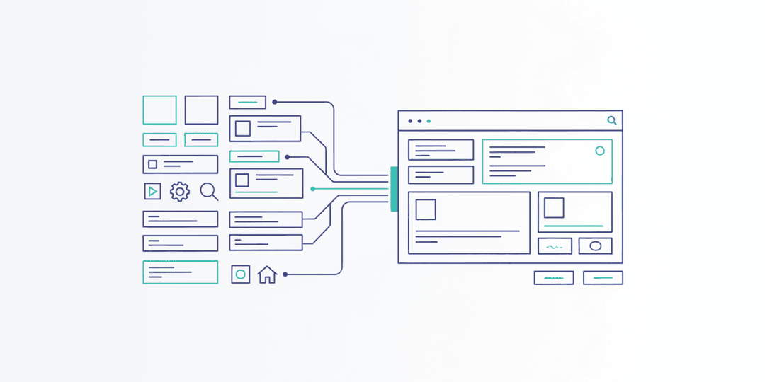
UX Is a Business Decision, Not Just a Design One
User experience design often gets filed under “design team stuff.” That’s a mistake. UX directly impacts your conversion rates, customer retention, support costs, and brand perception. Every confusing form field, every hidden navigation menu, every unclear error message is a tiny tax on your revenue.
You don’t need to become a UX designer. But understanding the principles behind great user experience makes you a better decision-maker when reviewing designs, evaluating proposals, and prioritizing features.
Here are seven UX principles that separate products people love from products people tolerate.
1. Consistency Builds Confidence
When buttons look the same across every page, when navigation stays in the same place, and when interactions behave predictably, users build mental models of how your product works. They stop thinking about the interface and start focusing on their task.
Inconsistency breaks that flow. A blue button that means “submit” on one page and “cancel” on another creates hesitation. Hesitation creates frustration. Frustration creates abandonment.
Business impact: Consistent interfaces reduce the learning curve for new users and decrease support tickets. When your product is predictable, people trust it enough to complete transactions.
2. Feedback Keeps Users Informed
Every action a user takes should produce a visible response. Click a button? It should change state. Submit a form? Show a confirmation. Something loading? Display a progress indicator. Without feedback, users don’t know if the system heard them — so they click again, and again, sometimes creating duplicate orders or corrupted data.
Business impact: Proper feedback reduces duplicate form submissions, decreases support inquiries (“Did my order go through?”), and increases user confidence throughout the purchase or sign-up flow.
3. Simplicity Drives Completion
Every additional field in a form, every extra click in a flow, and every unnecessary option on a page reduces the percentage of users who complete the task. This is known as the progressive disclosure principle — show only what’s needed at each step, and reveal complexity gradually.
Simplicity doesn’t mean dumbing things down. It means removing friction. A checkout flow with three steps converts better than one with seven. A dashboard that highlights the three most important metrics serves users better than one showing thirty.
Business impact: Simpler flows convert at higher rates. Period. Every field you remove from a form can increase completion rates by 5-10%.
4. Accessibility Expands Your Audience
One in four adults in the United States lives with a disability. When your website or app isn’t accessible, you’re excluding a quarter of potential customers. But accessibility isn’t just about disability. It’s about usability in all conditions — bright sunlight, slow connections, one-handed phone use, noisy environments.
Accessible design means sufficient color contrast, keyboard-navigable interfaces, properly labeled form fields, and content that works with screen readers. These improvements make the experience better for everyone, not just those who depend on them.
Business impact: Accessible sites reach more customers, improve SEO (search engines love well-structured content), and reduce legal risk. Web accessibility lawsuits have increased steadily year over year.
5. Visual Hierarchy Guides Attention
Users don’t read web pages. They scan them. Visual hierarchy is how you control what they see first, second, and third. Size, color, contrast, spacing, and position all signal importance.
A page where everything is the same size and weight is a page where nothing stands out. Your primary call to action should be the most visually prominent element. Secondary actions should be visually subordinate. Supporting information should recede into the background.
Business impact: Strong visual hierarchy increases click-through rates on calls to action and reduces time-to-conversion. When users instantly see what to do next, they do it.
6. Error Prevention Beats Error Messages
The best error handling is preventing errors from happening in the first place. Input masks that format phone numbers automatically. Disabled submit buttons until required fields are completed. Date pickers instead of free-text date fields. Inline validation that flags problems before the user hits submit.
When errors do happen — and they will — the messages should be specific, human-readable, and positioned next to the problem. “An error occurred” helps no one. “Please enter a valid email address” tells the user exactly what to fix.
Business impact: Error prevention reduces form abandonment, decreases support volume, and improves the perception of product quality. Users who never encounter errors have a smoother path to conversion.
7. User Control Builds Trust
Users want to feel in control of their experience. That means easy undo functionality, clear back navigation, the ability to cancel in-progress actions, and settings they can adjust to their preferences. It also means not hijacking their experience with forced pop-ups, auto-playing videos, or aggressive chatbot interruptions.
When users feel trapped — unable to go back, close a modal, or find their way to the previous screen — trust evaporates. And once trust is gone, it rarely comes back.
Business impact: Users who feel in control stay longer, explore more, and are more likely to return. Products that respect user autonomy generate higher lifetime value per customer.
Putting It All Together
These seven principles aren’t independent checkboxes. They work together. A consistent, simple interface with strong visual hierarchy and good feedback creates an experience that feels effortless. Add accessibility and error prevention, and you’ve built something that works for the widest possible audience with the least possible friction.
The businesses that invest in UX consistently outperform those that don’t. Not because good design is a nice-to-have, but because every interaction is either building trust or eroding it.
If your digital product isn’t converting the way you need it to, the answer is usually somewhere in these seven principles. At Project Assistant, we apply these principles to every project we take on — because great UX isn’t a phase of the project. It’s the foundation of the entire product. Ready to see what better UX could do for your business? Let’s have that conversation.